|
As fall transitions into winter, it's a good time to refresh your home's color palette. Richer tones, warm neutrals, and natural textures can make living spaces feel more comfortable and inviting during the cooler months.
The good news is that you don't need to repaint your walls or replace your furniture to make a seasonal update. Adding a few accent pieces, changing textiles, or incorporating different colors through accessories can make a noticeable difference.
Here are six fall and winter color combinations worth considering for your home. |
|
|
|
|
|
|
Rust, Terracotta & Warm Brown |
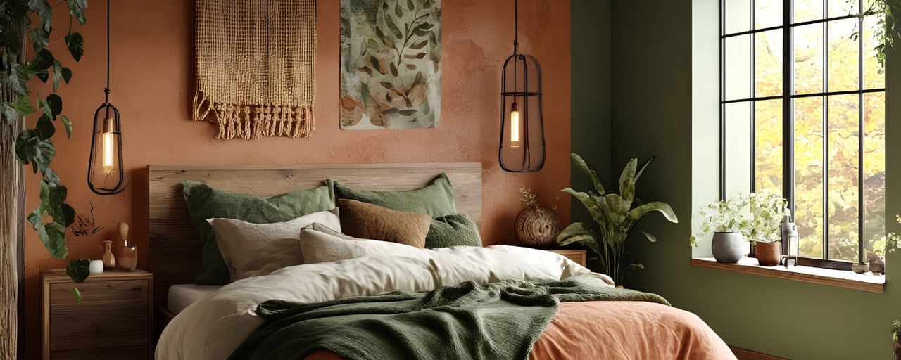
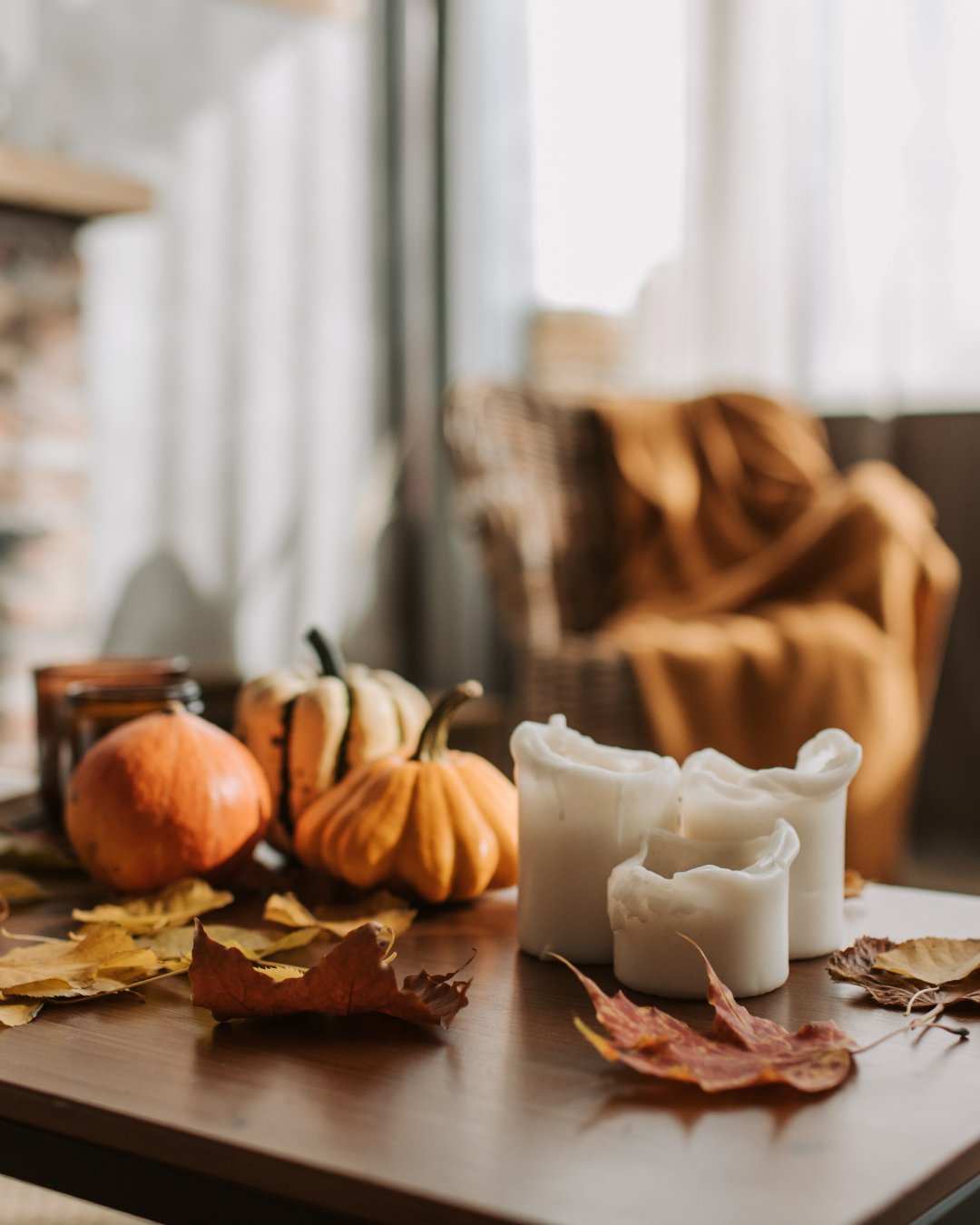
| Earthy tones are a natural choice for fall, but they also work well throughout winter. Rust, terracotta, and warm brown bring depth and warmth to a room without feeling overly seasonal.
These shades pair particularly well with natural wood, leather furniture, woven materials, and cream-colored upholstery. |
|
|
| | |
|
|
|
| | | Olive green is a versatile color that brings a natural element into the home. Paired with cream, it creates a balanced look that works with both traditional and contemporary interiors.
Unlike brighter greens, olive has a muted quality that makes it easy to combine with existing furniture and finishes. |
|
|
|
|
|
|
Burgundy, Wine & Soft Blush |
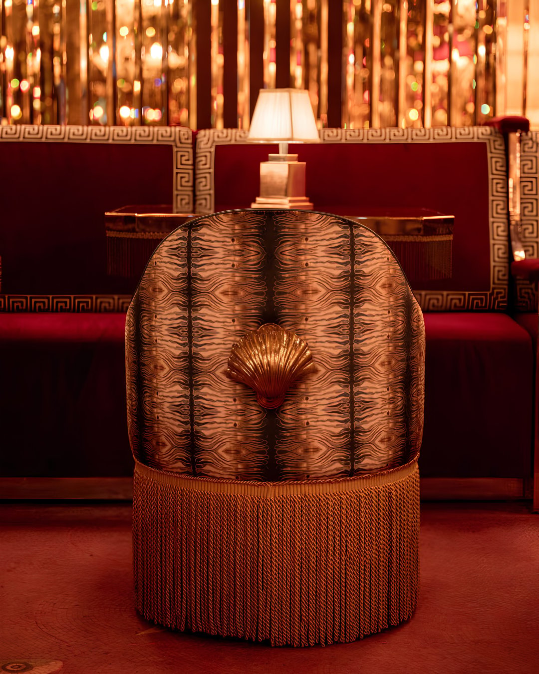
| Deep reds are a good way to introduce richer colors during fall and winter. Burgundy and wine tones add character to a space, while soft blush and warm neutrals keep the overall palette balanced.
This combination can work particularly well in dining rooms, bedrooms, and formal living areas. |
|
|
| | |
|
|
|
| | Chocolate Brown & Caramel |
| Brown tones have become a popular alternative to cooler gray interiors. Chocolate brown adds richness, while caramel brings warmth without making a room feel too dark.
These colors work well with natural materials and can complement many existing neutral palettes. |
|
|
|
|
|
|
| Not every fall and winter color palette needs to feature warm browns and oranges. Navy blue offers a cooler alternative while still creating a comfortable, grounded look.
When paired with warm ivory, wood tones, and brass accents, navy can feel classic rather than overly formal. |
|
|
| | |
|
|
|
| | | For homeowners interested in something different from traditional fall colors, plum, mauve, and taupe offer another option.
Plum provides depth, while muted mauve and taupe soften the overall look. Together, these colors create a balanced palette that works well with natural materials and neutral furniture. |
|
|
|
|
|
|
Finding the Right Fall and Winter Colors for Your Home
The best seasonal color palette is one that complements your home's existing design and feels comfortable to live with. Rust and terracotta offer warmth, olive green brings a natural element, and chocolate brown adds depth. Burgundy and plum introduce richer accent colors, while navy provides a classic alternative.
You can also mix elements from different palettes to create a look that feels more personal.
As the seasons change, consider starting with a few smaller updates before making larger design decisions. Sometimes, changing the colors and textures in a room is enough to give it a fresh look for fall and winter. |
|
|
|
|
|
|
|
Compass is a real estate broker licensed by the State of California operating under multiple entities. License Numbers 01991628, 01527235, 01527365. All material is intended for informational purposes only and is compiled from sources deemed reliable but is subject to errors, omissions, changes in price, condition, sale, or withdrawal without notice. No statement is made as to the accuracy of any description or measurements (including square footage). This is not intended to solicit property already listed. No financial or legal advice provided. Equal Housing Opportunity. Photos may be virtually staged or digitally enhanced and may not reflect actual property conditions. |
|
|
|
|
|
|